(UPDATED) Wolvden & the Incessant Battle for Pretty Lore: Changing how we view the Biography section
|
(UPDATED) Wolvden & the Incessant Battle for Pretty Lore: Changing how we view the Biography section
|
|
|---|---|
|
Posted 2020-12-13 19:58:59 (edited)
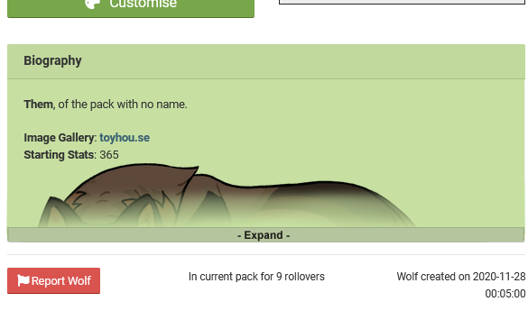
Wolvden & the Incessant Battle for Pretty Lore: On my wolf’s personal profile the ‘Biography’ section doesn’t spark joy. As many of us are reliving our teenage dreams so comes the desire of wanting to write a our very own wolf novel. Wolvden seemed like the perfect place to display and read an individual character’s personal journey. (mockup by Nestly) |
 🕊️ ELEVENELS #504 |
|
Posted 2020-12-13 22:40:34 (edited)
Support, omg. I'd also like some sort of universal indicator (like, a symbol you can see from the den) that a wolf has a character bio (like a tickbox under settings, or something.) It'd be up to individual users to decide which wolves to mark, of course. Edit: wait, I guess the book you can add to taglines counts for that. I barely see people using it, though. |
 unsknown #21142 |
|
Posted 2020-12-14 10:07:06
I've never cared for how cramped the bio section felt. Full support. |
 Wildtale #11560 |
|
Posted 2020-12-14 10:26:54
Yes please! |
 💜 WynBird 💜 #14758 |
|
Posted 2020-12-14 17:22:47
This change would spark joy. <3 |
 Cheℓs ❄️ #6918 |
|
Posted 2020-12-14 17:53:15
BIG SUPPORT! This is the next best thing to a fully customizable page for your den or wolves. |
 Sharky #4688 |
|
Posted 2020-12-14 18:37:00
Maybe if we can change the colors too that'd be Epic- green doesn't really suit a lot of my images but yeah! Expandable/collapsible box is a good idea!! |
⭐🌙 EVENTIDE #30642 |
|
Posted 2020-12-14 20:08:58
oh i completely support this as well!! |
 Cake🍰 #21684 |
|
Posted 2020-12-16 08:39:58
Full support. Its definately a awkward height, this would feel much better to me. |
VehementRed #1248 |
|
Posted 2020-12-16 08:44:10
Support! The box is very cramped, and whenever I want to read another wolf's lore, I have to scroll down often, reading with a limited view and all. |
Lakia #11020 |

