💬NEED LOTS FEEDBACK ON MY DESIGNS [URGENT]💬(I want lots of peoples options please)
|
Posted 2021-02-25 13:07:17
of course! i love designing wolves too so i understand wanting helpful feedback. also you’re my friend so i’m not gonna ignore that you need advice :) |
 Rosesociety {T3 Breeder} #34545 |
|
Posted 2021-02-25 13:09:04
Expect a free design for one of your wolves as a thank you!!! (Not gonna say which wolf) :) |
 ⭐StarGirl⭐ #32728 |
|
Posted 2021-02-25 15:58:05 (edited)
Alright so I'm not really an expert and my opinions are very biased towards my personal taste, but I hope this helps in some way!
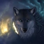
2/sulphur: Not a big fan, the merle is too overwhelming for my personal taste. It doesn't really feel like an intentional design if that makes sense? I do like the ice eyes though! 3/titanium: The overall look is nice and I think black/white/red is a combo you can't go wrong with. I really like how the black sort of frames the face! The main issue I have with it is that I don't think the pallid skin works well. It makes the eyes look a bit weird to me 4/blonde: I think the main issue I have with this one is that the marking colors don't really suit the base? The brown is ok, but the red and honey are too saturated against the muted blonde I think. I also feel like the white elbows aren't really doing anything for the design? I like the contrast of white details but there needs to be more of it for it to feel cohesive imo. Something like gentle unders would work well there. 5/auburn: Love this one! The soft gradients and marbled unders are just perfect - no complaints 6/oroide: This one is nice, theres some nice gradients happening and the blue eyes are an interesting contrast. I think the smoothness of the body feels a bit unbalanced compared to the more detailed face, but that's probably nitpicking. It works. 7/obsidian: Possibly one of my favorites, I like the hint of gray that shows against the black and brown. It looks really cuter overall, has a sort of domestic look. :) 8/pewter: I kind of like it, but kind of don't like it? I think the red should be a little less intense, and maybe change the eye color? Personally it comes across as a bit too much red white and blue for me. 9/pale: Not my personal taste, but I do think there's some interesting contrast going on here. To me the yellow eyes stick out weirdly though? I like the sort of cotton candy looking blue/pink/white. 10/russet: I like this one alot! The face is especially cute 11/teardrop: I think all the solid black is a bit overwhelming against the bright base, especially since all the lighter marks seem to disappear into the base. Adding something dark in the first slot would probably fix it? 12/teardrop: Personally I don't really like this one mostly because I don't really like the stripe markings. I think it is an improvement over the first design for this wolf though, since I do think there is a better balance with the black marks. 13/teardrop: This is my favorite design for the teardrop base marking-wise, but my main problem with all 3 teardrop designs is the pale skin. I always feel like it gives the eyes a very strange look, but that is more of a personal thing since I just don't like it on any wolf. 14/opal: I love this one! A brighter eye color might work better for contrast but I don't really have any problems with it. |
 badweather #1805 |
|
Posted 2021-02-25 18:40:09
Thank you for your feedback. |
⭐StarGirl⭐ #32728 |